
Monday, January 18, 2010
Educating Design Clients
Of course, if you have any other suggestions of good articles, I'd love to hear them.
- The Value of Design: Why Hire a Graphic Designer (Gizmo Design)
- Making the Most of a Design Engagement (Adpative Path)
- How to (and not to) work with a designer (Will Harris)
- 5 Things Your Clients Should Know (Webdesigner Depot)
- Working with your designer (Random Non Sequitur)
Monday, December 7, 2009
In Which I Land on Boagworld
Labels: podcasts, recommendations, reviews, webtech
Thursday, September 24, 2009
Product Review: Prezi
Like PowerPoint, Prezi is intended to help you communicate the key points of your presentation through visual reinforcement. Unlike PowerPoint, Prezi has jettisoned the boring, linear, bullet-point structure we've come to expect from such programs and replaced it with a user experience in which the viewer feels as though they're flying above and zooming into a giant map of your presentation. You can even change the structure of the presentation on the fly in order to react to your audience's questions. It really has to be seen to be believed.
Prezi's user interface for creating presentations is equally as innovative. Instead of a standard toolbar, the tool menu items are presented as bubbles attached to a larger bubble that rotates when clicked upon. When you place an object onto your map, a set of concentric circles is overlaid, and each circle does something different: one allows you to drag the object through 2D space, one allows you to resize, and one allows you to rotate.
I do have a few quibbles with the product, of course. While you can change the basic look of your presentation, you can't choose custom colors or fonts, or change the shape of your frames. A great deal of precision is needed to select multiple objects in editing mode which sometimes means performing the same action three or four times before you get it right. Also, while you can embed many different types of media, from still images to video, there is no way to embed links to a live website, which make for a much more dynamic presentation than simple screen shots of a website.
Prezi should prove useful to designers in several ways. Of course, if you give presentations or make client pitches, the benefits of Prezi's ease of production and its added "wow factor" will hook you right away. But the unique interface should also prove inspirational to designers as it illustrates the power of rethinking design elements that we tend to take for granted. Finally, it should be useful to information architects as a mind-mapping application. I've tried several such applications over the years and Prezi beats them all for ease of use in actually getting your ideas down on the screen and illustrating the relationship between them.
Like most web apps, there's a three-tiered pricing scheme; the free version includes the Prezi logo on all of your presentations, while the next level removes that and provides more storage, and the most expensive level allows you to edit your presentations offline (all versions include the ability to play presentations offline). The free version is more than worth a trial run.
Labels: presentations, reviews, webtech
Thursday, July 16, 2009
Presentation: Twitter in Higher Ed Communications
Labels: highered, presentations, webtech
Wednesday, June 24, 2009
Project Update: The Law School Redesign
In many ways, this project has been very unlike the other projects I've detailed on this block. This is by the far the biggest project that I have worked on, both in terms of amount of content and the number of people involved. While most of my previous projects have involved, at most, the client plus one other designer, this one involved a team of two designers (from the small Chicago design firm Rogue Element) and a development team of half a dozen members of the Chicago web development firm Palantir.net, not to mention the many stakeholders at the Law School itself.
Also unlike other projects I've worked on, in which I've often done design and development, my role here was generally limited to information architecture and project management. Aside from gaining some valuable experience in keeping so many moving parts going in the right direction, this also meant that I had the chance to observe the processes by which Rogue Element and Palantir worked. Getting to observe some more-experienced colleagues as they worked was a great learning experience.
The biggest difference between this project and the others I've worked on, however, was that I was, for the first time, playing the role of the client while working with other designers and web professionals. This is something that I think most web designers don't get the chance to do often, and I found that it provided me with some valuable insight into the assumptions at play on both sides of the working relationship. I hope that I can use this insight to make my own interactions with clients even more productive.
Labels: design, projectupdate, webtech
Monday, May 25, 2009
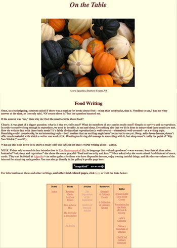
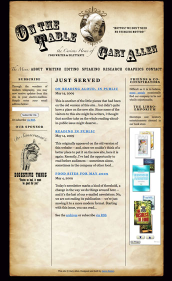
Project Update: On the Table
I had three goals for the redesign of the site:
1) Give the site a more professional look without losing the personality and sense of humor of the original. While Gary had been a professional illustrator and print designer earlier in his career, he didn't quite know how to make those skills translate onto the web. I felt that, if the web site was going to be his professional face, it needed a cosmetic overhaul. But I wanted to be sure that the look retained the quirkiness (and faint whiff of curmudgeon) that seemed to be part of what set him apart from his peers. As it turned out, this was actually the easiest part of the project. One of the advantages of having a close family member as a client is that you don't necessarily need to spend a lot of time getting to know them, their likes and dislikes, and so on. I initially pitched a "tongue-in-cheek antiquarian" approach, and Gary, while suggesting a few tweaks (the curve on his name, which really helped smooth out the header, was his idea), loved my first draft.
2) Refine the site's information architecture to highlight Gary's wide variety of skills. The original site contained a lot of information. Because it had grown up rather organically, it was not always clear how certain pages were related to others, and there was no consistent navigation. Since the the site's primary purpose was to land Gary more jobs, I decided to focus the information architecture around the different skills he can brings to, ahem, the table. This way, the visitor is quickly made aware of what Gary can do for them and their food-related projects.
3) Make it as easy as possible for visitors to sign up for his newsletter. For years, Gary has sent out a weekly email featuring culinary quotes, links to food-related sites and other such miscellanea. With nearly 600 subscribers, this newsletter has been Gary's primary promotional tool for many years; however, it was nearly impossible to find out how to sign up for it on his old site. So I wanted to make sure that there was a sign-up for the mailing list on every page. I also wanted to ensure that visitors could use subscribe an RSS feed of his updates, so I convinced him to turn the mailing list into a blog ("Just Served") that is integrated seamlessly into the site. This gives him the advantage of consistently adding new content to the site (a plus for search engine optimization) as well as the ability to archive his weekly updates on the site.
Below are images of the original site (left) and post-redesign (right).
Labels: design, projectupdate, webtech
Wednesday, March 18, 2009
Presentation: Social Media for Arts and Humanities Nonprofits
Labels: meetthesocialmedia, webtech
Wednesday, December 17, 2008
Building (Virtual) Community in the Big Easy
Now, I'm not a programmer by trade or by inclination, so there was plenty of full-frontal nerdity at this conference that flew well over my head (I'm pretty sure at one point folks at one presentation were actually talking in PHP), though the introduction to the Views module by inventor Earl Miles was worth the price of admission to me. Most fascinating to me, though, were the talks about community building, particularly those by Brian Oberkirch and Lane Becker. They really got me thinking about how we can continue our mission to make the Law School's site into an extension of the very distinct community it represents, to function as a virtual Green Lounge (the main gathering place at the school) where people can debate, argue, and laugh together.
What's great about using Drupal as a tool for this task is that it is more than a content management system -- it's a community of people building a platform for building communities. Interaction and community are, as one presenter put it, "baked into the code."
Labels: personalnarrative, webtech
Monday, December 8, 2008
Project Update: The Law School Twitter Feed
The Law School now has its very own Twitter account, which can alert you to newly added content from everything from our Faculty Podcast to our alumni magazine.
If you're the curious type and are wondering how I accomplished this feat, read on.
When we in the Communications department here at the Law School first started trying to figure out how we might be able to use Twitter, our first inclination was to aggregate the Twitter feeds of our brave student and faculty Tweeters into a single stream and feed it back into Twitter. We eventually settled on the TweetChicago format for two reasons. Most importantly, we felt that format did a better job at putting faces to stories, but also... it is much harder than it sounds to effectively aggregate Twitter feeds.
I recently decided to tackle the problem again in order to address a long-standing problem with our Facebook Page. One of our goals for the Facebook page was to allow our "fans"quick access to our various blogs and podcasts, and while RSS aggregating apps exist for Facebook, most of them don't really seem to work -- I was having to manually refresh. The best way to get an RSS feed into Facebook remains their "Notes" application, but you can only import one feed at a time into Notes. So what's a poor Manager of Electronic Communications to do?
Now, I'm no programmer, so I knew I was going to have to turn to a third-party tool. Initially, I tried FeedInformer (formerly FeedDigest), a service I've had some success with in the past. However, just pulling a bunch of feeds together and outputting a list wasn't going to make much sense to our end users; how were they supposed to know whether the post they were about to click on came from our Faculty Blog, our Admissions blog, our Student Events podcast, or what? We needed a way to add a prefix to the title of every post that explained which feed it was coming from.
I was going to have to use (gulp) Yahoo Pipes.
I had tangled with Pipes once before, when attempting to create a simple aggregated feed of Tweets from members of the UWebD community. While making that pipe any more complex than a simple aggregation was beyond my skills due to the vast amount of potential data involved, I figured that with a small set of feeds I could jerry-rig something that might work.
I began by creating a pipe for each of the feeds I wanted to include (including all the aforementioned blogs and podcasts as well as a del.icio.us feed of Law School-related news stories. As you can see in the screen shot below, these pipes just 1) grab the feed, 2) replace the beginning of the post's title with a prefix reflecting the feed it comes from, 3) sort the feed by pubDate and 4) outputs the feed.
The next step was to aggregate all of those pipes into one. This "master pipe" 1) grabs each of the earlier pipes 2) removes the author tags (for some reason, they were creating problems in the output) 3) sorts by pubDate again 4) truncates the feed to 10 items for the sake of simplicity and 5) outputs the feed, which I can import to our Facebook Notes or (ta-da!) route to the UChicagoLaw Twitter account via Twitterfeed.
This system is still not perfect -- Twitterfeed seems to have a tendency to choke on the feeds created by Pipes, and sometimes posts tweets up to 24 hours after the original post (which sort of negates the immediacy that makes Twitter so appealing).
Labels: projectupdate, webtech
Thursday, December 4, 2008
"Mapping Memory" Finds a New Audience
Monday, November 10, 2008
TweetChicago: Behind the Scenes
Last month the Law School announced its TweetChicago page, which collects together an ever-increasing number of our faculty and students' 140-character-or-less musings on the micro-blogging service known as Twitter. Since then we've had several inquiries as to how we put this little experiment together, so here's a real brief explanation.
TweetChicago is basically just built off of the standard HTML/javascript widget that Twitter makes (not-so-easily) available:<div id="twitter_div">
<ul id="twitter_update_list"></ul>
</div>
<script type="text/javascript" src="http://twitter.com/javascripts/blogger.js"></script>
<script type="text/javascript" src="http://twitter.com/statuses/user_timeline/username.json?callback=twitterCallback2&count=5"></script>
Just change "username" above to the name of the user whose tweets you'd like to widgetize, change the "count=" to the number of tweets you'd like to display, and paste into your webpage.
Just like that, you have your first tweeter's widget.
The tricky part comes in when you want to include multiple widgets on one page. Because of the way Twitter's javascript is written, it will only call one tweeter's feed on each page. You can get around this by creating a separate page for each tweeter (e.g., "tweeter1.html," "tweeter2.html," etc. You can then embed these pages in your aggregator page using iframes:
<iframe id="tweeter1" src="tweeter1.html">
Note that the tweeter's individual pages will need to include a link to the .css file you're using to style them, as the styles from the main page where you're embedding the iframes will not apply to the pages contained within iframes.
This is not a terribly elegant -- nor, unfortunately accessible -- solution, but it's the only way I could figure out to get around the one badge per page bug.
Tuesday, October 28, 2008
An Event Apart Chicago, Day 2: The Two-Weeks-Later Wrap-up
Rob Weychart, "Design Lessons in Chess" - Having recently discovered a passion for reading about chess, Weychart found some similarities between the ancient game and the design process, which he summed up with the following points:
- Content is king.
- Know your history.
- Think ahead.
- Don't get too attached.
- Act with purpose.
- Obey circumstance.
- Principles are your friends. Except when they're not.
- The journey is as important as the goal.
Cameron Moll, "The In-House Designer" - Co-author of one of my favorite web design books
Curt Cloninger, "What Would William Do?" - Cloninger took a look at how William Morris might approach the current sterility and stagnation of design on the web; among other things, he argued for typography being the natural material of the web and that beauty is not mere ornametation but added value.
Finally, Jeff Veen argued in "Designing the Next Generation of Web Apps" that rather than telling people stories, web apps should be giving people the tools to tell their own stories, moving from narration to discovery, from visual cues to interactivity, and from editing to filtering.
So, to sum it all up: An Event Apart was definitely worth attending. The speakers were, by and large, fascinating and inspirational. Being the veteran of not a few academic conferences, I am pleased to say that not once was I bored at this one -- perhaps the highest praise of all.
Monday, October 13, 2008
An Event Apart Chicago, Day 1: The Ten-Minute Wrap-up
Jeffrey Zeldman, "What is Web Design?" - Zeldman's talk was something of a "state of the profession" address, but for me the biggest resonance came in the first few minutes, when he asked what skill web designers need most. His answer (and mine): empathy. To be able to put yourself in the user's shoes, and understand the user's experience is key to everything else we do. What struck me about this answer is that it is also what scholars of religion (as I used to aspire to be) ask of their students in attempting to learn unfamiliar cosmological, theological, and eschatological views; it struck me that this was something I had left out of my post describing the similarities between my old career and my new one.
Jason Santa Maria, "Storytelling by Design"- Santa Maria's basic argument was that if web designers are narrators of stories told by websites, we should be using more adventurous visual layouts to augment those stories, in the way that magazines do, and not succumb to sameness.
Sarah Nelson (of Adaptive Path), "Design Criteria" - Nelson described hwo she manages the creative process, and argued that generating with the client a set of 5-7 short, memorable, strategic directives in writin can help your team focus its creative efforts.
Jason Fried (of 37signals), "User Interface Design Beyond the Basics" - The money quote for this one: "Copywriting is interface design."
Andy Clarke, "Underpants Over My Trousers" - The highlight of the day for me. An avid comic book fan, Clarke discussed how he found inspiration for designing a Puerto Rican newspaper site by studying the ways that comics use the convention of differently sized, shaped, and arrange panels to build drama.
Monday, September 15, 2008
Project Update: Forward Alliance
When Ioanna came to us, she had an existing website that was generally serving her needs; however, she felt that it could use some reorganization and a visual overhaul. She also wanted a postcard-sized mailer that could be used to market her services to other professionals in her building, etc.
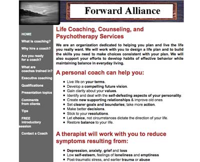 the original Forward Alliance website
In our initial discussions, we touched upon the need for a visual identity that would link the website, the mailer, and her business card and decided that the first step was the creation of a Forward Alliance logo (something she had not previously considered). Building on Ioanna's core mission of promoting personal growth, Katie and I collaboratively came up with the mark below.
From there, we moved on to creating the business card and mailer, with Katie doing the majority of the work on these. Ioanna chose to focus these pieces on the message of growth conveyed by the grass portion of the mark, rather than the entire mark, since she felt that they were intended more to market her personal services rather than the business as a whole.
 business card
 postcard, front
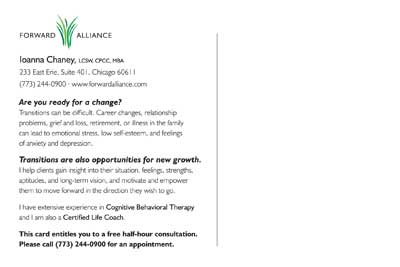 postcard, back
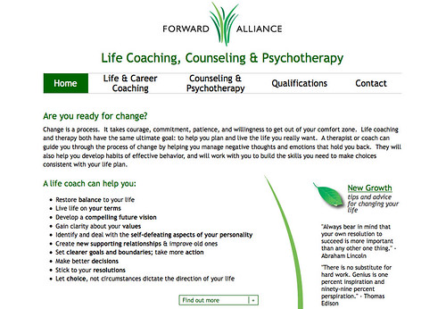
Finally, I set to work on the website. The goals of this portion of the project were to create a standards-compliant (and therefore more search-engine friendly) site, with a cleaner, more polished look that was still friendly, warm, and welcoming. Since frequently updated content is also more attractive to search engines, we also decided to convert the "Tips" section of the previous site -- in which Ioanna had posted some of her favorite quotes and sayings -- into a blog-like section of the site called "New Growth." The tips section has always been a favorite of her clients, and now they have the capability to have new tips delivered directly to the their inboxes or feed readers. If you have a chance, take a look at the site and let me know what you think!
Labels: design, projectupdate, webtech
Thursday, September 11, 2008
Found in Translation
Labels: webtech
Tuesday, September 2, 2008
Twitter: Redefining Spam?
Traditionally, spam has comprised unsolicited advertisements such as the ones for V1@gra you find in your email inbox every day, or links published in the comment sections of blogs. In short, spam has always been unwanted information pushed by the spammer to the spamee.
Twitter has always made it difficult for unwanted information to be pushed to a user -- one must choose to follow another user in order to receive updates from that user. But spam on Twitter has come to mean not just the provision of unwanted information, but the consumption of information as well. Among other things, Twitter defines spam thusly:
Commercial or promotional use of Twitter is allowed. There are many companies who create valuable, opt-in relationships with users on Twitter who want to keep up to date with them. However, if you are following other accounts in order to gain attention to your account or links therein, you may be considered spam. [emphasis in original]Take a moment to consider what this means: potentially accusing of malfeasance users who are requesting to view what is for all intents and purposes a public stream of information (viewable on the Twitter public timeline and even indexed on Google). It's not unlike me accusing you of a malicious act for subscribing to this blog. Furthermore, the language is so broad as to be almost absurd; if you don't want to gain attention for one's Twitter account, why would you undertake the essentially exhibitionist act of opening one to begin with?
Now, I'll confess that I've a vested interest in all this, since I've undertaken activity on Twitter that would probably be considered spamming under this definition. I opened an account for my band, and started following a bunch of people I didn't know (for the record, hardly anyone I know in meatspace is even on Twitter) who lived in Chicago and/or expressed interest in alt.country music. Admittedly, part of my motivation for doing so was to alert those I was following to the existence of my band; however, I also follow their Tweets to find out what's going on in the city where I live and in a musical genre that I love. How will Twitter decide whether that action constitutes spam or not? By way of an algorithm? Or by means of the human spam wranglers they have begun to hire?
Of course Twitter users should have the right to keep their Tweets out of the hands of those they don't wish to see them. But Twitter already makes that very easy by providing the ability to make one's updates secure, requiring approval of all followers. Defining any act of following a Twitter feed as potential spam will only hamstring the social networking potential of Twitter, as users become afraid to reach out to people who don't already know them. Instituting algorithms to decide the intentions of human beings will only lead to a lot of unhappy users.
Labels: webtech
Monday, August 25, 2008
Mapping Memory: Web Designer as Information Cartographer
I'm ready for my close-up, Mr. Zeldman. :-)
Labels: webtech
Tuesday, August 12, 2008
Writing for the Web: 5 Guidelines
As the Law School moves closer to our goal of a redesigned and re-engineered website, it's time for our staff to begin working on content -- creating new copy, editing existing pages, and pruning out-of-date text. While many of our staff are experienced and accomplished writers, we sometimes forget that writing for the web is different than writing for other purposes. Numerous studies have indicated that people simply read differently on the web.
To that end, I've prepared a brief set of guidelines for staff to consider as we undertake this process. These rules are synthesized from my own experiences on the web as well as from two great books: Don't Make Me Think by Steve Krug and Killer Web Content
by Gerry McGovern.
1. The reader comes first.
- Know your audience. Before you begin writing or editing, take a few minutes to think about who will be reading the copy you're about to work on. Will they be prospective students? Faculty? Alumni? What will they already know about the Law School? What do you need them to know? What will they want to know? (Note that these are three very different questions.)
- Put yourself in the reader's shoes. As you are writing or editing, imagine yourself as one of those readers. Ask yourself if what you've written so far will help the reader get the information they need and/or want as efficiently as possible.
- When in doubt, borrow a fresh pair of eyes. Ask a colleague or student worker to look over your copy and point out what isn't clear at first glance. Then refine accordingly.
2. Brevity + Clarity = Good.
- Be concise. The more information on a page, the harder it is for the reader to find what he or she is looking for. Usability expert Steve Krug suggests cutting half the words you've written, then cutting in half again. While that practice might be extreme, always remember that less is more.
- Web surfers don't read -- they scan. Our eyes usually skip over long blocks of text as they try to find a relevant needle in a haystack of information. To help your visitors out:
- Use visual anchors such as bold headings and lists, when appropriate.
- Keep your paragraphs short and make the first sentence of each paragraph attention-grabbing and relevant to the rest of the paragraph.
3. Make your links a call to action.
- Links also serve as visual anchors. Readers' eyes gravitate quickly to links as they scan the page's content. Make that fact work for you to help them find what they're searching for. For example, which of the examples below gets you to the downloadable presentation more efficiently?
"A presentation on this topic is also available. To download the presentation, click here."
"A presentation on this topic is also available."
4. Web content is never "done."
- Remember that whatever you write will have to be maintained and kept up-to-date for a significant period of time. The only thing worse for a reader than not being able to find information is finding wrong or out-of-date information.
5. Don't reinvent the wheel.
- Does the content you're creating exist in another form somewhere else on the site, or somewhere else on the web? Why not just link to already-existing content, instead of creating more content that will require maintenance?
I'm sure more guidelines will emerge as we go through the content-production process. Are there things that you think I've left out? As a web-reader, what bothers you about the way content is sometimes presented? What are some examples of well-done web writing?
Labels: books, design, webtech
Tuesday, July 22, 2008
Social Networking: Why?
Why?
Why bother putting so much information about myself out into the world? Is it simply exhibitionism that leads one to sign up for a FriendFeed account and broadcast to anyone with an internet connection all the movies they're renting from Netflix and the photos from their friend's karaoke party that they've posted to Flickr? Or is it a lack of connections to people in realspace? And the hidden subtext to these questions: in a world where identity theft seems to have replaced nuclear war as everyone's number one fear, isn't it dangerous to let people know so much about you?
I've been thinking a lot about these questions lately. I don't consider myself an exhibitionist (a ham, perhaps, but not an exhibitionist). Part of the answer is a geeky fascination with new toys ("ooh, this sounds cool!"), and a professional need to keep up with the blistering pace with which new web technologies seem to be generated. When my boss or a freelance client says, "Tell me about NewKilllerApp.com," I need to be prepared. Like Dr. Jekyll, I have little choice but to experiment on myself before I can provide answers to the people who sign the checks.
Moreover, it's quite possible that my livelihood may eventually depend upon my participation in these networks. One's prospects for attracting work have always depended a great deal upon whom one knows, and what those people know about one, whether through direct experience or through word of mouth. In the Web 2.0 world, one has the opportunity to exponentially increase the number of people who know about you, as well as to have some measure of control over what they know about you. For information workers, our online identity becomes a brand.
This explains why I also participate in networks that are not obviously career-oriented. Our personality is part of our brand, and becomes a means for people to sort the signal from the noise. If a potential client discovers that we like the same music via my iLike feed, or that we like the same books via GoodReads, that is an anchor that provides them some traction in the swirling stream of information surrounding the potential hires they are considering. If a colleague I've never met who works at another university posts a question to Twitter that I am able to answer in a funny or memorable way, they may keep me in mind the next time a position opens at their school. Put in utilitarian terms, social networking is a way to build social capital that may pay dividends down the road.
Labels: personalnarrative, webtech
Monday, June 30, 2008
Project Update: New Law School Sites
Last week, the University of Chicago Law School unveiled two new websites, designed and built by yours truly. One is an online version of our alumni magazine, The Record. The Record Online will contain many of the same stories as the print version of the magazine, but will enhance them with extras like audio and video, as well as the ability for our readers to comment on the stories.

The second site is one devoted to a little experiment that we're running here at the Law School, which we're calling "Ideas Are Everywhere." The plan is to send copies of our faculty's more accessible works (beginning with Richard Posner's How Judges Think and Martha Nussbaum's Liberty of Conscience) out into the world, with labels asking people to visit the "Ideas Are Everywhere" website. We'll ask them to tell us where they found the book (which we'll track on a Google map), and what they think of the ideas contained therein; we'll also request that they pass the book on by leaving it in a coffeeshop, on an airplane, or anywhere else an interested party might find it.

Certainly, neither of these sites is earth-shaking in regards to its design or functionality. But they each gave me a chance to try something new. The Record Online was my first stab at creating a site using the open-source content management system Drupal, which we'll be adopting when the Law School launches its new primary website in the fall. It gave me the chance to poke around under the hood and try to wrap my mind around the way Drupal works (though I have much, much more to learn!).
The "Ideas Are Everywhere" site, on the other hand, is built on Typepad (which we also use for our Faculty Blog); the challenge here was to make a site built on a blogging platform feel as little like a blog as possible. Given that I had about a week to get the site up before the first books were to be distributed -- projects at universities seem to either drag on interminably or have to be done immediately -- I needed to be able to quickly and easily give readers the ability to comment and to subscribe to comment feeds. Using Typepad but removing many of the traditional markers of a blog seemed to be the most time- and cost-efficient way of doing so.
So what do you think? See any room for improvement on these sites?
(portions of this post are cross-posted at the University of Chicago Law School Electronic Projects Blog)
Labels: design, projectupdate, webtech
Saturday, May 31, 2008
What is a Web Professional?
So what exactly do I mean by a "web professional? Quite simply, it's someone who makes their living building and/or managing websites. Back in the bad old days there was really only one necessary skill set for people who worked on the web (coding HTML) and one job title ("webmaster," or if they wanted to be fancy, "web designer"). But as websites and the technology that drives them have become more and more complex, the number of skills that one needs to have just to keep one's ahead above water has ballooned.
As with any growing field, some practitioners become specialists in one area while others take a jack-of-all-trades generalist approach. But there are certain areas that I think every web professional must occasionally dip their toes into, whether they like it or not. The best web professionals will have skills in some or all of these diverse fields:
User Experience Design. The core goal of every website is to allow communication between the website visitor (or user) and the organization or individual behind the website. It is essential that everyone involved in websites have an understanding of how their users (or intended users) interact with websites, and how they can help those users find the information they are looking for (and thereby increase the chance that they will perform the actions that you hope they will take). Improving the user's experience should be the core of every decision made in the creation and evolution of a website.
At the core of user experience design is information architecture -- figuring out how the information you are presenting to the world fits together. This includes things like being able to create intuitive navigational categories and making sure that a user will have all the information needed to complete a given task.
Closely related to information architecture is interface design; this is the "look-and-feel" of the site. A perfectly planned-out information architecture isn't much use if you can't provide the user with visual cues about how that architecture works. Interface design should also include a solid grasp of semantic markup and CSS, so that the content can be accessed and understood even by those who can't see the visual design of the page due to disability or the size of their screen.
Content Production. Skills in writing and copy-editing are extraordinarily important for web professionals. Almost everyone who works on the web will find themselves responsible for writing content at some point, and without quality content even the most well-designed website is essentially useless. Ideally, content should be written in a style suitable for the web; short paragraphs and the appropriate use of lists to make text easily scannable are key.
Programming & Development. Code geeks are what most people tend to think of when they think about web professionals. Developers are the ones that make the web work, inventing new technologies and exploring the limits of existing ones to create exciting web applications. Even if they are not developers, most web professionals wind up having to learn at least a little PHP or some other programming language, if for no other reason than the fact that they have to be able to communicate with their techies and be able to know what is possible and what is not.
Multimedia Production. Audio and video are no longer fun extras; they are expected forms of content delivery for most types of website. Web professionals are increasingly having to learn how to create, edit, and deploy this content.
Octopus Wrangling. Increasingly, organizations' web presences are no longer confined to their own website. Twitter, Facebook, YouTube, iTunes, and other outlets for user-generated content have created the opportunity to have multiple web presences, sending your content slithering out to find interested users without them having to find you (some have called this the "social media starfish," but I prefer the octopus metaphor -- it's creepier). Today's web professionals not only have to figure out the best ways to adapt a particular tentacle's technology to their organization's marketing strategies, but they also have to keep tabs on a rapidly exploding field and recognize which new social media have staying power and are worth the investment of time and work hours.
Sunday, May 18, 2008
The Typographer's Dilemma
The holy grail for web designers, then, is the ability to embed font files themselves in a web page so that anyone who views the page can see the text in the intended font, whether or not they have the font installed on their computer (see a proof of concept here). I think it is inevitable that this will happen eventually, but it raises the question of how font designers and type foundries will be paid for the work they do. Right now, as I understand it, they get paid by licensing their fonts to be included in operating systems (Mac, Windows) or software (e.g. Adobe's applications), or individual users can purchase the rights to purchase a font file and use the typeface in personal or commercial products. But if the fonts are essentially downloadable at any time by anyone for free, where is the incentive for type designers to continue investing the considerable amount of care and time necessary for producing a quality font?
In a lot of ways font designers and type foundries find themselves in situations similar to those of musicians and record companies. Because fonts are digital files they are, like .mp3s, incredibly easy to copy and redistribute (or "pirate," as the RIAA would have it). It must not be possible to include digital rights management (DRM) measures in font files, or I'm sure the big foundries would have done so already. Instead, font producers try to cover their costs by charging astronomical sums to those who do wish to use them legally (non-designers might be surprised to learn that individual fonts can often cost up to $400), just as prices for legally purchased music have failed to fall appreciably, despite the fact that the cost of distributing that music is approaching zero. Both industries, it seems, are locked into pre-Internet business models that lead only to the frustrated customers -- and, as a result, "stolen" files.
How then, might type designers adapt to new distribution models in a way that would both satisfy their customers and make money in the coming age of embeddable fonts? The changing music industry may be a model for the solution, as well as the problem.
- Sell fonts as a loss leader for other services. Just as many musicians have had to begin thinking of recorded music not as their primary product, but as a way to promote their other services (touring and performing) and products (merchandise), so font designers could use free versions of their fonts as promotional tools for any number of other services and products, from printing to web design to (in Adobe's case) software.
- Free version/Pro version. Some font designers already do this, allowing free use of "lite" versions of their fonts for personal use, and requiring licenses for commercial use. This is not unlike the recent experiments by Radiohead (with their "In Rainbows" album and Nine Inch Nails (with their album "Ghosts," among others), where basic .mp3s were made available for free with the hopes that the artists could recoup their costs from more elaborate packagings of the material (hi-fidelity box sets, for example).
- License their fonts to browser manufacturers. In the same way that font designers license their products to companies like Adobe, they could strike deals with browser manufacturers to package them in browser software. Unfortunately, I can imagine there might be problems getting licenses for opensource browsers such as Firefox.
- Taxes. The most controversial means of font designers recouping costs on illegally shared font files might be something like that proposed to get record companies a share of money from their pirated music files: a tax on internet connections, to be charged by Internet service providers, which could then be distributed among the people who own the legal rights to files (see here and here. There is a significant downside of this plan, in that the logistics of distributing the revenues it generated would probably be quite difficult; however, it would likely be less difficult to implement than the licensing fees charged by performing rights organizations like BMI and ASCAP to live music venues, which allows any performer in those venues to play songs to which they do not own the rights. Moreover, it would both allow web designers and website users to have access to a much greater variety of typefaces and ensure that designers of those typefaces would be compensated for their work.
Saturday, May 3, 2008
Presentations: Podcasting & New Media
The second presentation, "Embracing Web 2.0 and New Media Communications," which was an expanded version of the presentation in November, was presented at the Council for Advancement and Support of Education District V's annual conference in December. While this one wasn't recorded, you can check out our slideshow below. If you download the prsentation, you can also read our notes that went along with it (which will make a lot more sense than just looking at the slides).
Thursday, February 7, 2008
Project Update: Recent Design Projects at the Law School
Since starting the job in August of last year, I've had the opportunity to do a couple of these projects. The highest profile one so far was a redesign of our Faculty Blog, which had been launched in 2005 using a slightly modified version of one of Typepad's standard issue templates:
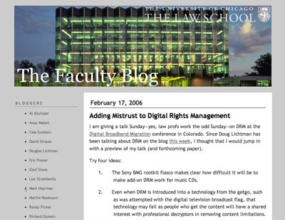
When I redesigned it this past fall, my primary goal was to make it more usable -- get rid of the gray text on a gray background, add a prominent search box and make it easier for visitors to subscribe to the blog and get to the Law School website. I also separated out the podcast feed and added a widget in the sidebar so people could listen to the podcasts without leaving the blog page.
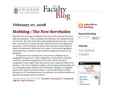
I was very pleased to see a presenter at the CASE V conference in December hold up the redesigned blog as an example of higher ed institutions "using social media well."
I also used this design as inspiration for a Flash e-card that the Law School's Annual Fund asked me to create. Considering it was my first attempt at Flash, I think the card came out pretty well. This was an especially fun project because I had the chance to create the music for the card as well. The music for these things is usually classical music calculated to be almost unnoticeable. I used a collage of samples from Apple's Garageband program to create a piece that sounds to me a bit like it could have come from "Six Feet Under;" I even had someone ask me where they could purchase a copy.
Wednesday, January 16, 2008
Project Update: Sacred Art Website
Back in November, I launched a website for a great little store in Roscoe Village called Sacred Art. Owner Sarah Chazin opened Sacred Art in 2006, intending to make the art of local Chicagoans accessible to their neighbors and create an alternative to the traditional art gallery. Instead of the stuffiness of those spaces, her store has the friendliness of a neighborhood shop, and showcases over 50 Chicago artists in every medium you can think of, from photography and painting to jewelry and textiles. There are pieces to fit every budget, providing everyone with the opportunity to own original art.
I had originally designed a small one-page site for Sacred Art back in 2006, then a group of local students offered to create a slightly larger site for the store as a class project. While Sarah certainly appreciated the students' generosity in building that site, it became clear that if she wanted to continue to grow her business, she would need a more consistent, user-friendly website. Also, she would need to be able to update it herself, with few technical skills and on a young business' shoe-string budget.
At our first meeting with Sarah, my Design:Intelligent partner Katie Petrak and I worked to identify who we were trying to reach and what sort of information would be contained on the site. The goals we identified for the site were:
• to let artists know how they can submit their art for consideration to be sold in the store
• to promote other services that the store provides, such as art rental, commissions, and hosting private events
• to highlight the many wonderful styles of art for sale in the store
• to promote events, such as classes and "meet-the-artist" opportunities
• to inform visitors of new arrivals to the store and other announcements
The first two needs could be easily solved by static webpages. The last three, however, would require some ingenuity in order to meet both the "low or no cost" and "little technical knowledge" requirements. Sarah didn't have the budget to pay for the time that would be required to implement and configure custom scripts for her site, nor did she have the time or inclination to learn the technical skills that could reduce the cost for installing those components.
So we looked for cheap third-party solutions. Her events calendar could be maintained for free on the very easy to use Google Calendar, then fed to her site via GCal's talent for producing RSS feeds. We found a similar work-around for the update feature, by using a feed from the free Blogger blogging platform. For the image gallery, we turned to image hosting site SmugMug, which gives Sarah the opportunity to easily upload and organize images; for a small yearly fee, we would be able to customize the look of the SmugMug site to match that of the rest of Sacred Art's site.
The next stage of the project was to create a new visual design that would be adaptable to these solutions, and would also more accurately reflect the character of the store than the Apple-esque gray text on a white background that had previously comprised the site. Katie devised a design with a rough, hand-made feel that manages to be slightly funky but still clean enough to not feel cluttered. The color scheme is based on the colors of the Sacred Art logo and the unique dark green that covers the store's facade.
Finally, it was up to me to build the actual pages, combining the design with the technology. The site was launched the day before Thanksgiving, the deadline we had set so that the site would be up and running for the holiday shopping season. Sarah is extremely happy with the site, and Katie and I enjoyed the process of creating something for a business that we really believe in. I think it's a great case example of how, with a little strategic planning, good websites don't need to cost an arm and a leg.
Labels: design, projectupdate, webtech
Friday, January 4, 2008
Confessions of a Reluctant Blogger
Since I filled a hand-made journal given to me by my oh-so-artsy high school girlfriend with the painfully earnest poetry of a grunge-era teenager so many years ago, I've resisted the diarist's urge. After my brief flirtation with chronicling a life that had barely begun, a diary seemed self-indulgent beyond the point that even my less-than-abstemious twenty-something self could tolerate. When people started posting the prosaic day-to-day minutiae of their lives on the (then-new) World-Wide Web, I was even more skeptical; it was clear to me that everyone's lives were in fact a lot less interesting than they themselves thought they were. The launch of technologies -- like Blogger, for example -- that were devoted to democratizing the weblog form beyond those who knew how to make webpages seemed like just another brick removed from the crumbling wall between the private and the public -- reality tv for the web medium.
And so I sat out the beginnings of the blogging revolution, satisfied that I was missing nothing. Why, then, after so many years of resistance, have I taken up the virtual pen now?
- Legitimate business reasons. Blogs have become an important part of the"starfish" promotional strategy of many businesses, politicians, bands, and so on, since they a) generate a lot of frequently updated content for search engines to latch onto; and b) give readers a reason to return to your site. If I'm going to use this site to promote my professional life, it makes sense to leverage this technology.
- Organizing one's thoughts is, uh, what's that word? Oh yeah, good. In these days of information overload, keeping track of the contents of one's mental life can be difficult. I find that with so many things competing for my attention, it's easy for some of them to slip through the cracks. Writing down my impressions of, for example, new developments in design will help me remember and sort them out, regardless of whether or not anyone else reads them. Like Montaigne's essais, blog posts provide the opportunity to examine, question, and evaluate the sea of signal and noise that often threatens to drown us. And unlike a traditional journal, a blog makes one's thoughts searchable.
- They're here to stay. Like it or not, blogs have emerged as arguably the most widespread application of the information revolution. If I'm going to position myself in the marketplace as a web professional, I need to have as much experience with them as possible.
So in this space, you'll find musings and notes on some of the things that make me tick both professionally (design, web technology and culture) and personally (mostly music, with the occasional diversion into my previous life as an academic studying the history of religions and Bollywood film). If, from time to time, you do me the honor of reading my ramblings, I hope they prove interesting and that you'll occasionally take the opportunity to leave some comments.
Labels: personalnarrative, webtech