
Monday, November 30, 2009
Design Lab: Infographic on Gun Control and Violent Crime
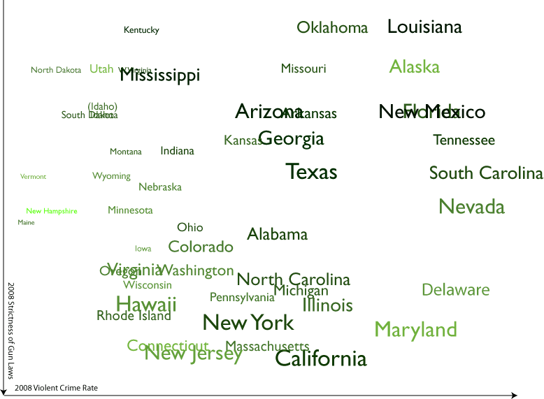
The graphic above charts 4 variables: the violent crime rate in a given state in 2008 (x axis), the strictness of a state's gun control laws as ranked by gun control advocacy group the Brady Campaign (y axis), a state's poverty rate in 2008 (on a spectrum from green [low] to black [high]) and a state's "diversity index" (the likelihood that two randomly selected people will be of a different ethnic group, as determined by the 2000 census; the larger the type, the more diverse the state). I had also thought about indicating both geographical proximity (by means of connecting lines, but these made the graphic nearly illegible) and population density (though I could think of no concise means of indicating that New Jersey's population density is 1000 times that of Alaska).
Now, I am no statistician or criminologist and I'll leave the conclusions to them, but it seems to me that this graphic does pretty well at one of the jobs of a complex infographic by, well, complicating the problem. The chart shows pretty clearly that strict gun control laws do not necessarily lead to a lower rate of violent crimes, but it also shows that fewer restrictions on gun ownership also do not lead to a lower violent crime rate -- an armed society is not, as some gun rights advocates would argue, necessarily a polite society (as to the wisdom of basing social policy on the musings of a science fiction writer, well, that's probably a subject for another infographic). Nor do the other variables represented indicate a singular cause of violent crime: some of the most diverse states are among the least violent, as are some of the least wealthy states. What the graph makes clear, I think, is that there is no simple answer to reducing violent crime.
So what do you think? How could this graphic be improved? How could I add more variables while keeping the image legible? I'd love to see some of my designer friends take a hack at this same problem and come up with a different way of looking at the data (which is available here, by the way).
Labels: design, projectupdate
Wednesday, October 14, 2009
Project Update: Lost Cartographers Poster
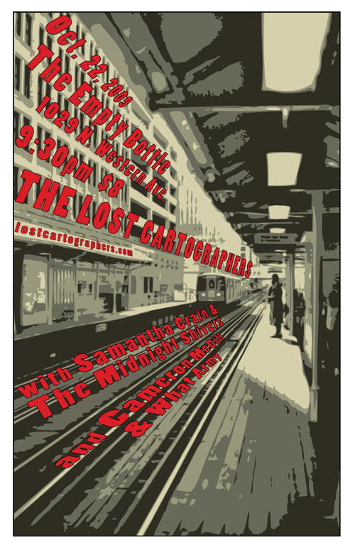
Next week, the Lost Cartographers and I will be playing at Chicago's legendary Empty Bottle for the second time; we'll be opening for the incredible Samanatha Crain & The Midnight Shivers (check out this preview of the show). The Bottle's promo folks asked us to provide some posters, and while we don't normally make posters (the return on investment is just too low in terms of getting people to come to the show), I decided it might be fun to do one for what promises to be such a great show.
I'd be interested to hear in the comments what you think about the poster -- does it capture our sound, and tell the story of our music (which you can hear here if you haven't already)?
Labels: design, lostcartographers, music, projectupdate
Friday, August 21, 2009
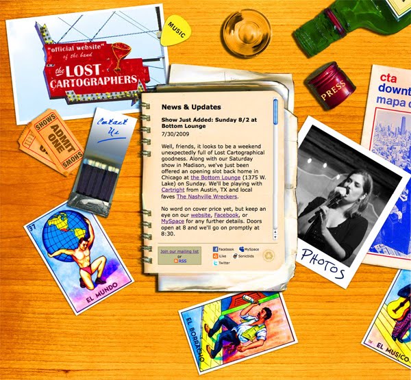
Project Update: Lost Cartographers Redesign
Here is the before:
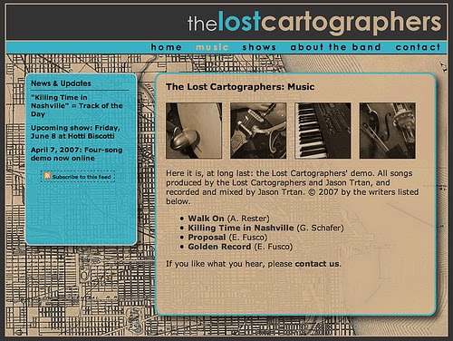

And the after:
Labels: design, lostcartographers, music, projectupdate
Wednesday, June 24, 2009
Project Update: The Law School Redesign
In many ways, this project has been very unlike the other projects I've detailed on this block. This is by the far the biggest project that I have worked on, both in terms of amount of content and the number of people involved. While most of my previous projects have involved, at most, the client plus one other designer, this one involved a team of two designers (from the small Chicago design firm Rogue Element) and a development team of half a dozen members of the Chicago web development firm Palantir.net, not to mention the many stakeholders at the Law School itself.
Also unlike other projects I've worked on, in which I've often done design and development, my role here was generally limited to information architecture and project management. Aside from gaining some valuable experience in keeping so many moving parts going in the right direction, this also meant that I had the chance to observe the processes by which Rogue Element and Palantir worked. Getting to observe some more-experienced colleagues as they worked was a great learning experience.
The biggest difference between this project and the others I've worked on, however, was that I was, for the first time, playing the role of the client while working with other designers and web professionals. This is something that I think most web designers don't get the chance to do often, and I found that it provided me with some valuable insight into the assumptions at play on both sides of the working relationship. I hope that I can use this insight to make my own interactions with clients even more productive.
Labels: design, projectupdate, webtech
Monday, May 25, 2009
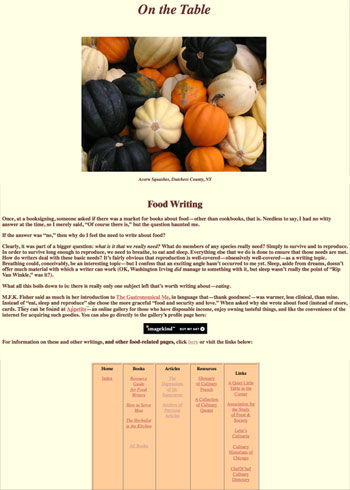
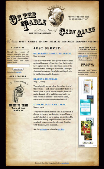
Project Update: On the Table
I had three goals for the redesign of the site:
1) Give the site a more professional look without losing the personality and sense of humor of the original. While Gary had been a professional illustrator and print designer earlier in his career, he didn't quite know how to make those skills translate onto the web. I felt that, if the web site was going to be his professional face, it needed a cosmetic overhaul. But I wanted to be sure that the look retained the quirkiness (and faint whiff of curmudgeon) that seemed to be part of what set him apart from his peers. As it turned out, this was actually the easiest part of the project. One of the advantages of having a close family member as a client is that you don't necessarily need to spend a lot of time getting to know them, their likes and dislikes, and so on. I initially pitched a "tongue-in-cheek antiquarian" approach, and Gary, while suggesting a few tweaks (the curve on his name, which really helped smooth out the header, was his idea), loved my first draft.
2) Refine the site's information architecture to highlight Gary's wide variety of skills. The original site contained a lot of information. Because it had grown up rather organically, it was not always clear how certain pages were related to others, and there was no consistent navigation. Since the the site's primary purpose was to land Gary more jobs, I decided to focus the information architecture around the different skills he can brings to, ahem, the table. This way, the visitor is quickly made aware of what Gary can do for them and their food-related projects.
3) Make it as easy as possible for visitors to sign up for his newsletter. For years, Gary has sent out a weekly email featuring culinary quotes, links to food-related sites and other such miscellanea. With nearly 600 subscribers, this newsletter has been Gary's primary promotional tool for many years; however, it was nearly impossible to find out how to sign up for it on his old site. So I wanted to make sure that there was a sign-up for the mailing list on every page. I also wanted to ensure that visitors could use subscribe an RSS feed of his updates, so I convinced him to turn the mailing list into a blog ("Just Served") that is integrated seamlessly into the site. This gives him the advantage of consistently adding new content to the site (a plus for search engine optimization) as well as the ability to archive his weekly updates on the site.
Below are images of the original site (left) and post-redesign (right).
Labels: design, projectupdate, webtech
Monday, March 2, 2009
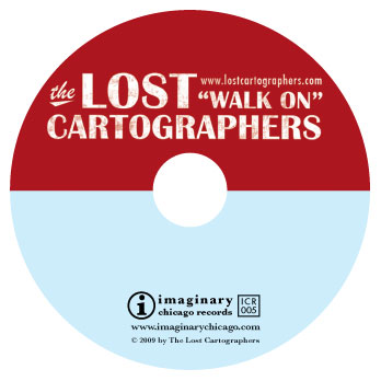
Project Update: "Walk On" Album Cover
It's been nearly as long in coming as "Chinese Democracy," but The Lost Cartographers' debut album is about to be sent off to the manufacturers. The album features cover and disc design by yours truly, working off of a photo of a South Side food & liquor joint that I found on Flickr (the photographer generously offered use of the photo for the price of a complimentary CD.
The goal here was to come up with a design that was timeless, reflected the sound of the band, and -- as our bassist Karl put it -- would look awesome on a t-shirt.

Labels: design, lostcartographers, projectupdate
Monday, December 8, 2008
Project Update: The Law School Twitter Feed
The Law School now has its very own Twitter account, which can alert you to newly added content from everything from our Faculty Podcast to our alumni magazine.
If you're the curious type and are wondering how I accomplished this feat, read on.
When we in the Communications department here at the Law School first started trying to figure out how we might be able to use Twitter, our first inclination was to aggregate the Twitter feeds of our brave student and faculty Tweeters into a single stream and feed it back into Twitter. We eventually settled on the TweetChicago format for two reasons. Most importantly, we felt that format did a better job at putting faces to stories, but also... it is much harder than it sounds to effectively aggregate Twitter feeds.
I recently decided to tackle the problem again in order to address a long-standing problem with our Facebook Page. One of our goals for the Facebook page was to allow our "fans"quick access to our various blogs and podcasts, and while RSS aggregating apps exist for Facebook, most of them don't really seem to work -- I was having to manually refresh. The best way to get an RSS feed into Facebook remains their "Notes" application, but you can only import one feed at a time into Notes. So what's a poor Manager of Electronic Communications to do?
Now, I'm no programmer, so I knew I was going to have to turn to a third-party tool. Initially, I tried FeedInformer (formerly FeedDigest), a service I've had some success with in the past. However, just pulling a bunch of feeds together and outputting a list wasn't going to make much sense to our end users; how were they supposed to know whether the post they were about to click on came from our Faculty Blog, our Admissions blog, our Student Events podcast, or what? We needed a way to add a prefix to the title of every post that explained which feed it was coming from.
I was going to have to use (gulp) Yahoo Pipes.
I had tangled with Pipes once before, when attempting to create a simple aggregated feed of Tweets from members of the UWebD community. While making that pipe any more complex than a simple aggregation was beyond my skills due to the vast amount of potential data involved, I figured that with a small set of feeds I could jerry-rig something that might work.
I began by creating a pipe for each of the feeds I wanted to include (including all the aforementioned blogs and podcasts as well as a del.icio.us feed of Law School-related news stories. As you can see in the screen shot below, these pipes just 1) grab the feed, 2) replace the beginning of the post's title with a prefix reflecting the feed it comes from, 3) sort the feed by pubDate and 4) outputs the feed.
The next step was to aggregate all of those pipes into one. This "master pipe" 1) grabs each of the earlier pipes 2) removes the author tags (for some reason, they were creating problems in the output) 3) sorts by pubDate again 4) truncates the feed to 10 items for the sake of simplicity and 5) outputs the feed, which I can import to our Facebook Notes or (ta-da!) route to the UChicagoLaw Twitter account via Twitterfeed.
This system is still not perfect -- Twitterfeed seems to have a tendency to choke on the feeds created by Pipes, and sometimes posts tweets up to 24 hours after the original post (which sort of negates the immediacy that makes Twitter so appealing).
Labels: projectupdate, webtech
Monday, September 15, 2008
Project Update: Forward Alliance
When Ioanna came to us, she had an existing website that was generally serving her needs; however, she felt that it could use some reorganization and a visual overhaul. She also wanted a postcard-sized mailer that could be used to market her services to other professionals in her building, etc.
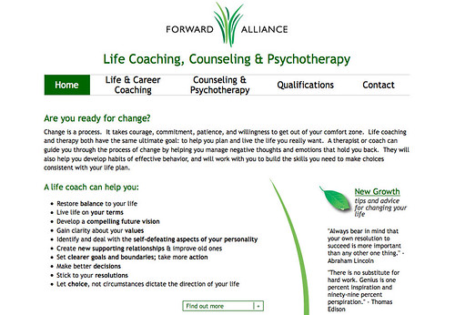
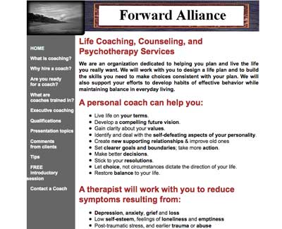 the original Forward Alliance website
In our initial discussions, we touched upon the need for a visual identity that would link the website, the mailer, and her business card and decided that the first step was the creation of a Forward Alliance logo (something she had not previously considered). Building on Ioanna's core mission of promoting personal growth, Katie and I collaboratively came up with the mark below.
From there, we moved on to creating the business card and mailer, with Katie doing the majority of the work on these. Ioanna chose to focus these pieces on the message of growth conveyed by the grass portion of the mark, rather than the entire mark, since she felt that they were intended more to market her personal services rather than the business as a whole.
 business card
 postcard, front
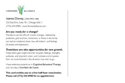 postcard, back
Finally, I set to work on the website. The goals of this portion of the project were to create a standards-compliant (and therefore more search-engine friendly) site, with a cleaner, more polished look that was still friendly, warm, and welcoming. Since frequently updated content is also more attractive to search engines, we also decided to convert the "Tips" section of the previous site -- in which Ioanna had posted some of her favorite quotes and sayings -- into a blog-like section of the site called "New Growth." The tips section has always been a favorite of her clients, and now they have the capability to have new tips delivered directly to the their inboxes or feed readers. If you have a chance, take a look at the site and let me know what you think!
Labels: design, projectupdate, webtech
Monday, June 30, 2008
Project Update: New Law School Sites
Last week, the University of Chicago Law School unveiled two new websites, designed and built by yours truly. One is an online version of our alumni magazine, The Record. The Record Online will contain many of the same stories as the print version of the magazine, but will enhance them with extras like audio and video, as well as the ability for our readers to comment on the stories.

The second site is one devoted to a little experiment that we're running here at the Law School, which we're calling "Ideas Are Everywhere." The plan is to send copies of our faculty's more accessible works (beginning with Richard Posner's How Judges Think and Martha Nussbaum's Liberty of Conscience) out into the world, with labels asking people to visit the "Ideas Are Everywhere" website. We'll ask them to tell us where they found the book (which we'll track on a Google map), and what they think of the ideas contained therein; we'll also request that they pass the book on by leaving it in a coffeeshop, on an airplane, or anywhere else an interested party might find it.

Certainly, neither of these sites is earth-shaking in regards to its design or functionality. But they each gave me a chance to try something new. The Record Online was my first stab at creating a site using the open-source content management system Drupal, which we'll be adopting when the Law School launches its new primary website in the fall. It gave me the chance to poke around under the hood and try to wrap my mind around the way Drupal works (though I have much, much more to learn!).
The "Ideas Are Everywhere" site, on the other hand, is built on Typepad (which we also use for our Faculty Blog); the challenge here was to make a site built on a blogging platform feel as little like a blog as possible. Given that I had about a week to get the site up before the first books were to be distributed -- projects at universities seem to either drag on interminably or have to be done immediately -- I needed to be able to quickly and easily give readers the ability to comment and to subscribe to comment feeds. Using Typepad but removing many of the traditional markers of a blog seemed to be the most time- and cost-efficient way of doing so.
So what do you think? See any room for improvement on these sites?
(portions of this post are cross-posted at the University of Chicago Law School Electronic Projects Blog)
Labels: design, projectupdate, webtech
Wednesday, January 16, 2008
Project Update: Sacred Art Website
Back in November, I launched a website for a great little store in Roscoe Village called Sacred Art. Owner Sarah Chazin opened Sacred Art in 2006, intending to make the art of local Chicagoans accessible to their neighbors and create an alternative to the traditional art gallery. Instead of the stuffiness of those spaces, her store has the friendliness of a neighborhood shop, and showcases over 50 Chicago artists in every medium you can think of, from photography and painting to jewelry and textiles. There are pieces to fit every budget, providing everyone with the opportunity to own original art.
I had originally designed a small one-page site for Sacred Art back in 2006, then a group of local students offered to create a slightly larger site for the store as a class project. While Sarah certainly appreciated the students' generosity in building that site, it became clear that if she wanted to continue to grow her business, she would need a more consistent, user-friendly website. Also, she would need to be able to update it herself, with few technical skills and on a young business' shoe-string budget.
At our first meeting with Sarah, my Design:Intelligent partner Katie Petrak and I worked to identify who we were trying to reach and what sort of information would be contained on the site. The goals we identified for the site were:
• to let artists know how they can submit their art for consideration to be sold in the store
• to promote other services that the store provides, such as art rental, commissions, and hosting private events
• to highlight the many wonderful styles of art for sale in the store
• to promote events, such as classes and "meet-the-artist" opportunities
• to inform visitors of new arrivals to the store and other announcements
The first two needs could be easily solved by static webpages. The last three, however, would require some ingenuity in order to meet both the "low or no cost" and "little technical knowledge" requirements. Sarah didn't have the budget to pay for the time that would be required to implement and configure custom scripts for her site, nor did she have the time or inclination to learn the technical skills that could reduce the cost for installing those components.
So we looked for cheap third-party solutions. Her events calendar could be maintained for free on the very easy to use Google Calendar, then fed to her site via GCal's talent for producing RSS feeds. We found a similar work-around for the update feature, by using a feed from the free Blogger blogging platform. For the image gallery, we turned to image hosting site SmugMug, which gives Sarah the opportunity to easily upload and organize images; for a small yearly fee, we would be able to customize the look of the SmugMug site to match that of the rest of Sacred Art's site.
The next stage of the project was to create a new visual design that would be adaptable to these solutions, and would also more accurately reflect the character of the store than the Apple-esque gray text on a white background that had previously comprised the site. Katie devised a design with a rough, hand-made feel that manages to be slightly funky but still clean enough to not feel cluttered. The color scheme is based on the colors of the Sacred Art logo and the unique dark green that covers the store's facade.
Finally, it was up to me to build the actual pages, combining the design with the technology. The site was launched the day before Thanksgiving, the deadline we had set so that the site would be up and running for the holiday shopping season. Sarah is extremely happy with the site, and Katie and I enjoyed the process of creating something for a business that we really believe in. I think it's a great case example of how, with a little strategic planning, good websites don't need to cost an arm and a leg.
Labels: design, projectupdate, webtech