
Monday, November 30, 2009
Design Lab: Infographic on Gun Control and Violent Crime
After last month's one-day course taught by Edward Tufte, I was inspired to try creating my own complex infographic. I decided to tackle a subject that comes up rather frequently in discussions with one particular family member: the relationship between gun control laws and violent crime.
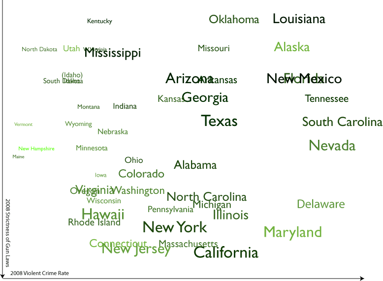
The graphic above charts 4 variables: the violent crime rate in a given state in 2008 (x axis), the strictness of a state's gun control laws as ranked by gun control advocacy group the Brady Campaign (y axis), a state's poverty rate in 2008 (on a spectrum from green [low] to black [high]) and a state's "diversity index" (the likelihood that two randomly selected people will be of a different ethnic group, as determined by the 2000 census; the larger the type, the more diverse the state). I had also thought about indicating both geographical proximity (by means of connecting lines, but these made the graphic nearly illegible) and population density (though I could think of no concise means of indicating that New Jersey's population density is 1000 times that of Alaska).
Now, I am no statistician or criminologist and I'll leave the conclusions to them, but it seems to me that this graphic does pretty well at one of the jobs of a complex infographic by, well, complicating the problem. The chart shows pretty clearly that strict gun control laws do not necessarily lead to a lower rate of violent crimes, but it also shows that fewer restrictions on gun ownership also do not lead to a lower violent crime rate -- an armed society is not, as some gun rights advocates would argue, necessarily a polite society (as to the wisdom of basing social policy on the musings of a science fiction writer, well, that's probably a subject for another infographic). Nor do the other variables represented indicate a singular cause of violent crime: some of the most diverse states are among the least violent, as are some of the least wealthy states. What the graph makes clear, I think, is that there is no simple answer to reducing violent crime.
So what do you think? How could this graphic be improved? How could I add more variables while keeping the image legible? I'd love to see some of my designer friends take a hack at this same problem and come up with a different way of looking at the data (which is available here, by the way).
Labels: design, projectupdate
Comments:
Links to this post:
<< Home
Welcome to here:
ugg boots sale
Bailey Button Ugg Boots
classic tall ugg boots
classic short ugg boots
bailey button uggs
ugg boots bailey button
bailey ugg boots
ugg bailey boots
ugg bailey button
tall ugg boots
classic tall boots
short ugg boots
classic short boots
I think you will like.
Post a Comment
ugg boots sale
Bailey Button Ugg Boots
classic tall ugg boots
classic short ugg boots
bailey button uggs
ugg boots bailey button
bailey ugg boots
ugg bailey boots
ugg bailey button
tall ugg boots
classic tall boots
short ugg boots
classic short boots
I think you will like.

Links to this post:
<< Home